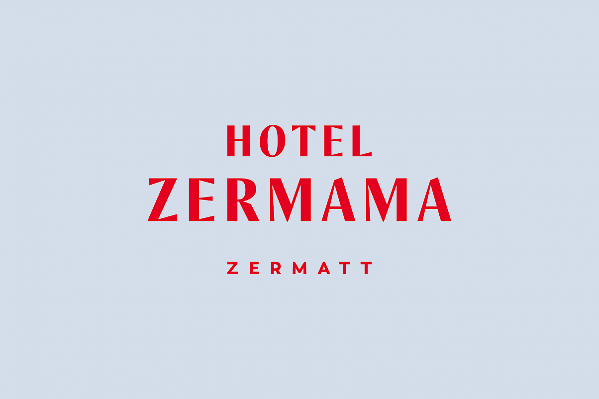
A LOGO WITHOUT MATTERHORN?
A dose of love, pinch of familiarity, drop of Zermatt, touch of freshness and a whole lot of Mama Style. Sound exciting? Well, it was! That was the process of logo development for our Hotel Zermama.
NOT REALLY MAINSTREAM
With strong lettering, Mama wanted to make a statement: Mama stands self-confidently, Mama creates trust, Mama comes from the mountains. The use of the Matterhorn in the logo was deliberately omitted. It just did not fit in there, after all, the horn is almost visible from every Mama hotel room. The light blue, taken from the sky above the Matterhorn, radiates harmony, freshness and serenity and the color red does not suit anyone better than our very own Mama Mariette. At first glance, this color combination may seem quite unusual for a hotel. But hey, what can we say, Hotel Zermama is not really "mainstream".


